
KingsVsPirates
[v0.2] Character Selection Screen
Hello all, finally I have some time to write a new post for kings vs pirates! 🏴☠️🏴☠️ 🥳
It's been a while since the last updates but I took this time to organize the project and focus on the game and I promise I will write here more :D. (PS I post much more on twitter, so follow me there and receive the news first 😜)
So let's start this week DevLog. Today I will present to you the new character selection screen, some prototypes and the final result.
While thinking about the selection screen, my main focus point was how to present the player, the possible characters and each of their characteristics and after some sketches, this was the result:

After the first implementation I was happy with the final result, but analysing and showing to my wife, there was too much details in the screen, for example, the board animation (not smooth), all the character appearing at same time, background almost the same color of the character slots, so I decided to go back to the drawing table ✍️ and came up with a second version of the screen:
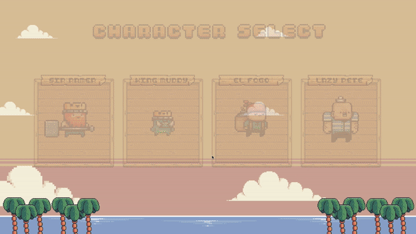
For this second approach I decided to make the options a little bit more clear, with the characters names on top, so after the menu fade in, the player will do the link between the name and the character quick. Besides that, I did all the character slots background, without a huge board in the back, leaving them in a prominent position in the screen.
Good 😁 I was happy with this solution, so I started to design the selection part, how to make visible for the player, that she/he are choosing the character they want to play with and came with the next possible solution:
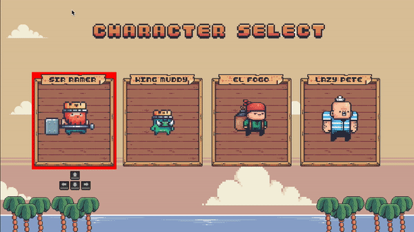
Basically the Idea was to give the player 2 feedbacks. First, the character that was current selected and how to move between the options. For the first one, a simple background, different from other elements on the screen, to be easy to be seen and for the second, an image with the linked controller used by the player.
But after analysing and get some feedbacks, the characters were still not the main focus on the screen while you look at it. What you see first, the big character slot background (again, I thought I had it solved 🤦♂️) and this was making me feel that something was missing on the screen, to make it fun and good for the player.
So I went back to my draws and started to do more sketches, combining good points from the previous versions and trying to incorporate more the theme of the game and the result is 🥁:
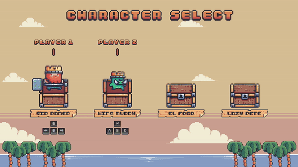
Yes, you choose the character from chests, like treasures 🥳! The overall feedbacks were good, and internally, I was very happy with the result.
Analysing this version of the screen, I give to the player 2 important things, first, thought the player how to select the characters, showing the selected controller on the bottom and give the player the curiosity to see which other character available exists and how they look like.
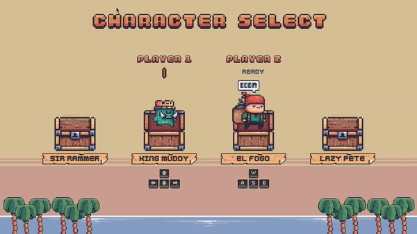
And to finalize, I added couple other details, when the character is selected. A funny message said by the character and a status instead of the selection arrow, arriving in the final version of the screen:
That's all folks! Hope you enjoyed, I'm learning a lot doing this and hope I can give you some ideas and thoughts while you design your own game and screens 😁
Feel free to add feedbacks/questions in the comments and see you all in the next post!
Leave a comment
Log in with itch.io to leave a comment.